
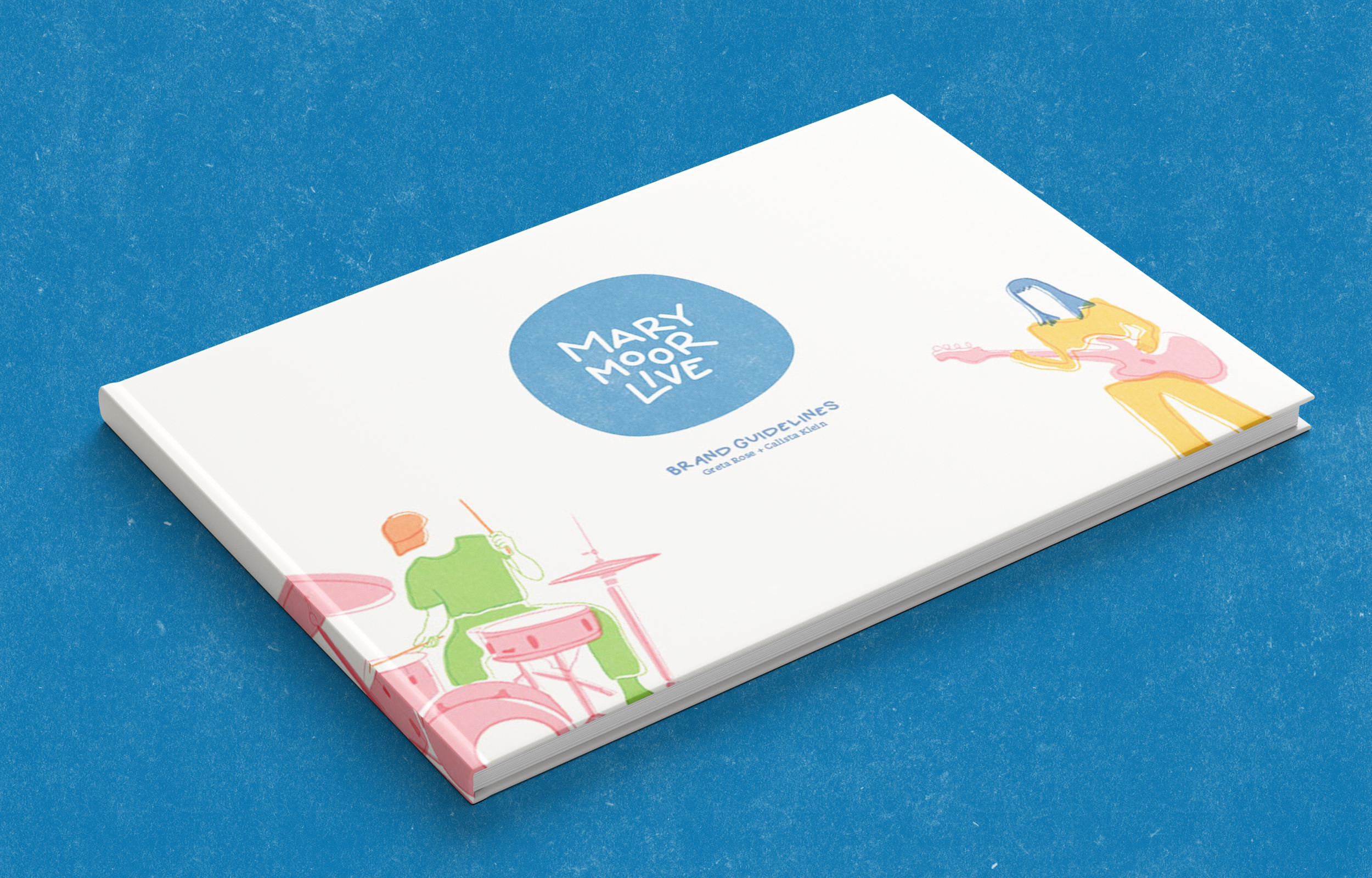
Marymoor Live
Branding, illustration, environmental graphics, art direction, motion, copywritingTools: Indesign, Procreate, Figma, Photoshop, Illustrator
Collaborators: Hand lettering Artist Calista Klein |Timeframe: Twelve weeks
Overview: Marymoor Live Concerts hosts an annual summer concert series in the 640-acre Marymoor Park. It is outdoors set in beautiful nature, seats 5,000 people, and hosts a variety of food trucks. The concerts run from May to September and host contemporary music in Redmond, WA.
Demographic: The history of the bands booked tend to be more familiar to Millennials and Generation X. Most attendees may bring their families or friends. Geographically, they are probably mostly from the King County area, although some concertgoers may be traveling from further away to see a favorite band. The audience is a blend of repeat attendees and first-time visitors. Recent booking and marketing efforts seek to appeal to Generation Z.
Challenge: Albeit a unique outdoor venue, Marymoor Live lacks a brand identity that reflects the idyllic nature of attending a show at the park during the summer. Our challenge was to develop a new and cohesive visual identity for Marymoor Live that reflects the quality of the experience of being at a show and the caliber of the artists that perform at the concert series.
Solution: Our solution to branding Marymoor Live is to reflect the idyllic and casual nature of the venue and highlight the inclusive shared experience of attending a show there. We accomplished this through the concept of Weaving Golden Hour Memories. To visually communicate this concept we focused on hand-touched elements like hand-lettered type and approachable energetic illustrations. The warm and playful color palette and subtle ink-on-paper texture further emphasize the welcoming attitude of the brand.
Deliverables
Brandmark
The imperfect circle, created with a golden ratio grid to further heighten the idyllic nature of the brand, is welcoming and soft. The hand-lettered type leans into the casual nature of the outdoor venue and marries it with the inclusive quality that Marymoor Live seeks to create with a diverse audience. The stacked nature of Marymoor Live logo harkens to speakers stacked on top of each other to amplify sound in a large space. Lastly, the faded blue texture reflects the casual approachable quality Marymoor Live strives for as a brand.


Process
Tonal Territories
-
![]()
Casual Tonal Territory
Calista and I took 70% of our inspiration from the casual tonal territory. The illustration style was inspired by the risograph print quality, texture and overlapping imagery from the vibrant dessert illustration. The casual tone conveyed with the faded blue stamps was used in creating our brandmark and textures. We also leaned into the warm summer color palette and the soft round quality of the sans serif terminals when developing our hand lettered type and custom illustrations. Lastly, the phrase “imperfect but not sloppy” was a measure we used to ensure we were consistent with our branding decision making process.
-
![]()
Idyllic Tonal Territory
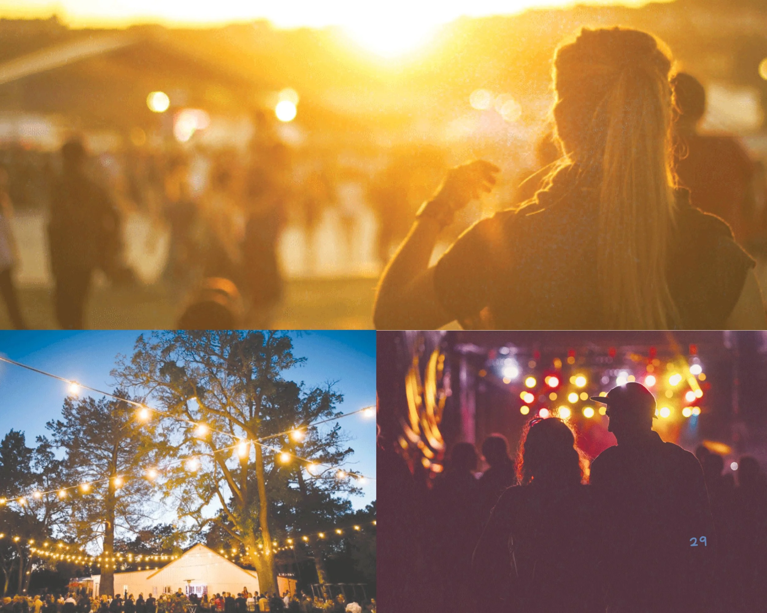
The idyllic tonal territory board accounted for about 15% of the branding for Marymoor Live. We embodied the idyllic quality of attending a show at Marymoor Live by capturing the golden hour moment of sharing a beautiful summer night with your friends and loved ones at a show. This was accomplished this by requiring photographs to have lens flare or subjects to be silhouetted by the setting sun or stage lights.
-
![]()
Inclusive Tonal Territory
We took 15% of the Marymoor Live brand inspiration from the inclusive tonal territory. The primary visual element we pulled from this territory was the colorful woven imagery. The weave represents the sense of community that is fostered when attending a live performance with total strangers and how Marymoor Live helps bring people together from diverse backgrounds. We made sure that the website and the email template passes WCAG color contrast standards and is digitally accessible to a large audience. We also exhibit inclusiveness through diverse subject representations in photography and illustrations.


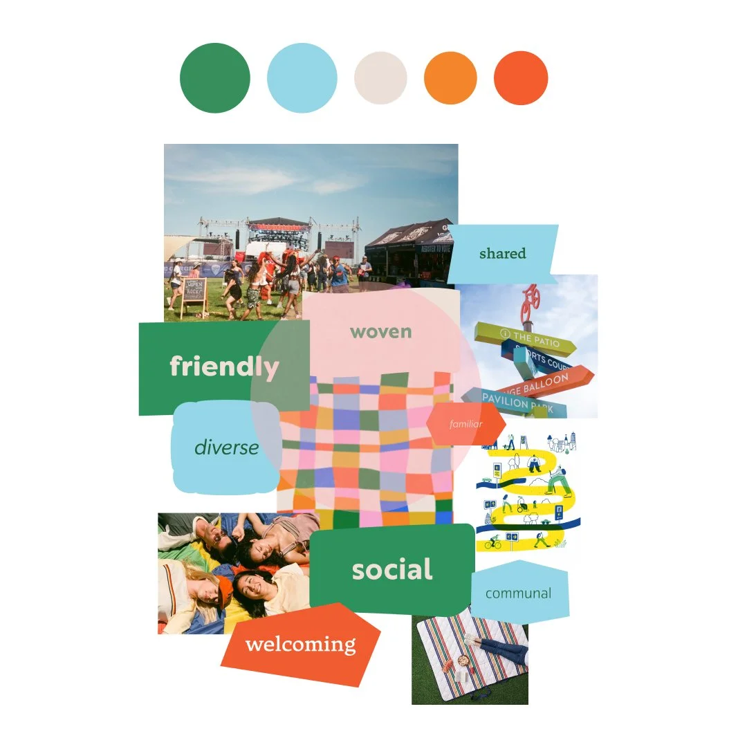
Concept Board
Marymoor Live is driven by the casual, inclusive and idyllic nature of the venue and the experience it provides. The overlapping Risograph print style and hand lettered custom type lends itself to the friendly, unique and welcoming nature of the brand. The color palette and the photography are soft and warm creating feelings of longing and nostalgia for summer nights with loved ones. The weave texture is emblematic of the diverse and inclusive community Marymoor Live is knitting together with their expertly curated line ups and distinctive venue.


Branding Elements
-
![]()
Illustrations
The custom illustrations for Marymoor Live celebrate the casual, inclusive nature of the venue. Featuring a combination of flat shapes and thin outline strokes, brand illustrations are as energetic and dynamic as the headliners at Marymoor Live.
-
![]()
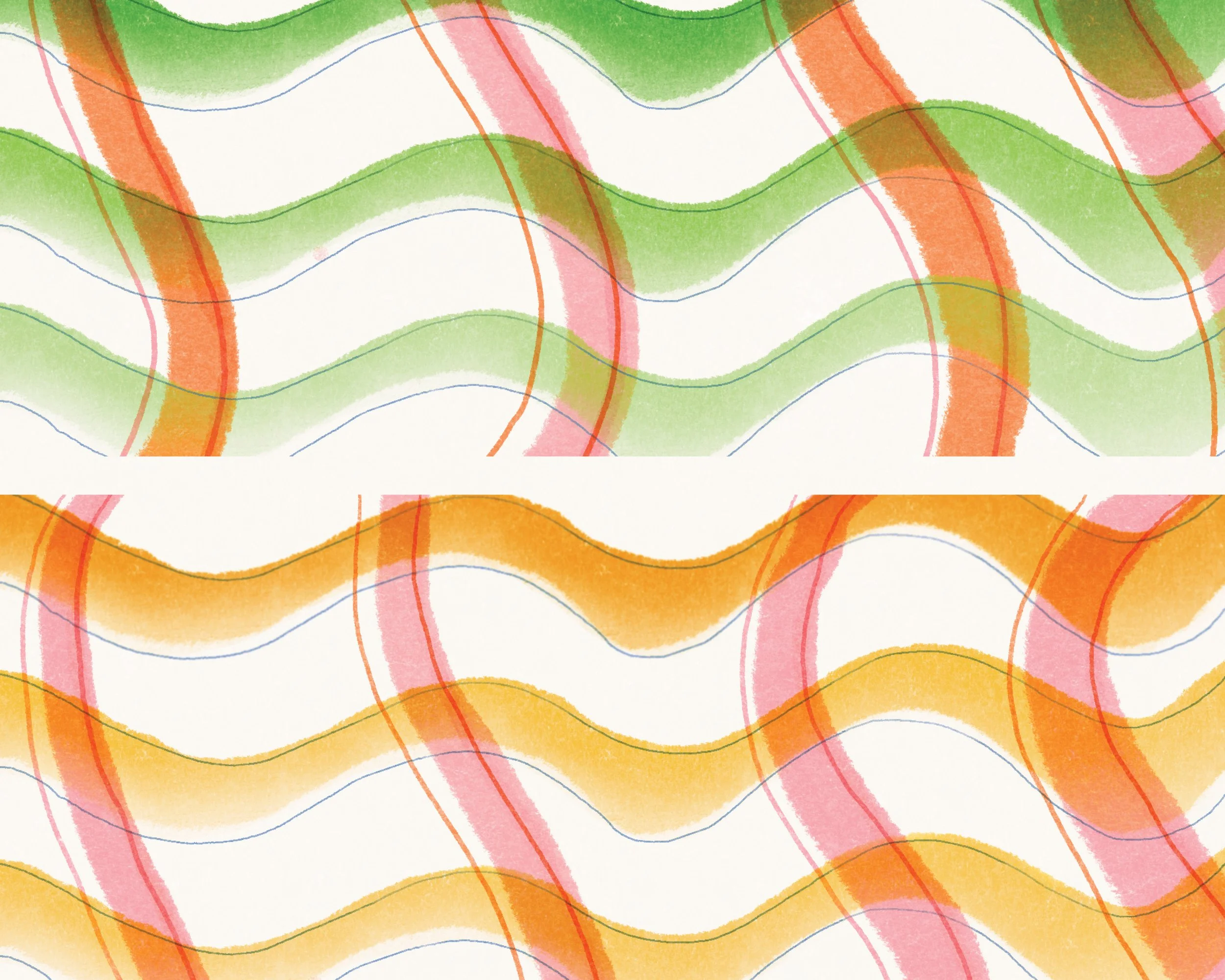
The Weave
The woven texture represents the inclusive nature of the Marymoor Live brand. Marymoor Live seeks to be accessible and to appeal to diverse swaths of the Seattle populace. The overlapping colors and texture are a metaphor for different communities of people coming together for a shared experience over music, food, drinks in the PNW outdoors.
-
![]()
Textures
Imperfect, but not sloppy, colored risograph style printed textures communicate the relaxed, intimate, and friendly nature of Marymoor Live.
-
![]()
Photography
We activate PNW summer nostalgia by using photography with lens flare and sunsets. The subjects in our photography are people in natural environments. We translate this experience into nighttime by ensuring subjects are lit by stage lights or string lights.
-
![]()
Color
Marymoor Live celebrates the golden days of a Washington summer with its color palette. Soft and warm, our yellow radiates energy like the summer sun. Blue represents the metaphorical infinite opportunities of a blue sky and a clear horizon. A vibrant green pays homage to the grass, sequoia trees and the natural beauty of Marymoor Live. The rosy pink represents warm sunny afternoon with friends listening to music and sharing drinks, and a warm 80% black to further drive home the brand promise of inclusivity and friendliness.
-
![]()
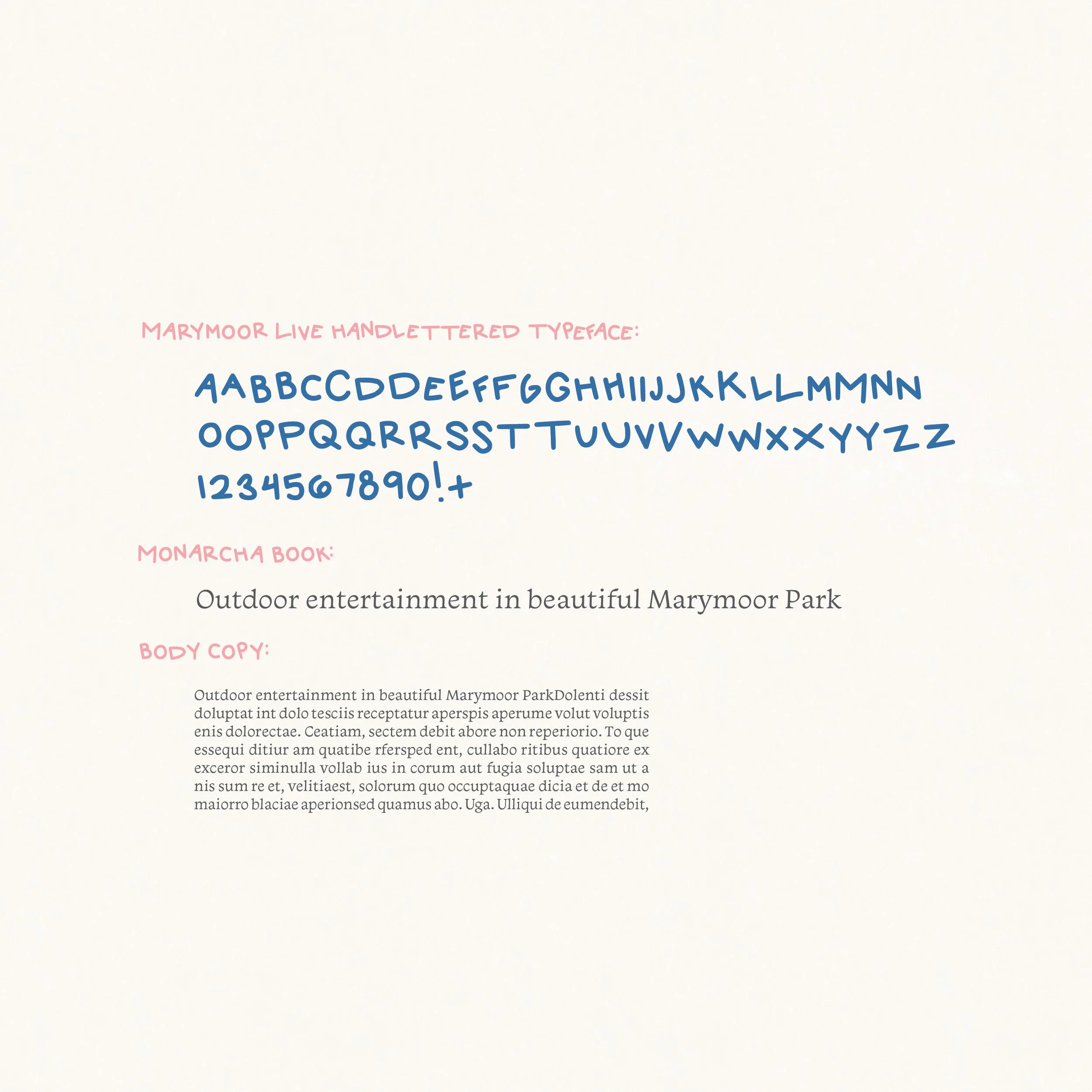
Typography
Marymoor Live is a unique experience and deserves typography as one of a kind as the venue itself. A custom hand lettered typeface is used for headliners and subheads. The rounded terminals speak to the pleasant and welcoming experience Marymoor Live offers to anyone engaging with the brand. Monarcha is used for body copy and sub-headers, when legibility and accessibility are paramount—for example, in documents with lots of body copy. Monarcha also has thick and thin strokes in its letterforms to create a feeling of expression and dynamism similar to the type of artists who will be performing at Marymoor Live.


Final Insights
Branding Marymoor Live was an excellent opportunity for Calista and me to collaborate, work towards a shared goal, and successfully develop a brand across multiple mediums. After thorough investigation and exploration, we arrived at a strong brand concept and saw it through to completion. Ultimately, it was a delight working with Calista on this project and I am super proud of what we came up with together!